After easily dispatching the Pittsburgh Penguins in a first-round sweep, the Islanders - often considered the little brother to the Rangers - have Long Island buzzing with excitement for their second-round matchup against the Carolina Hurricanes, who pulled a dramatic Round 1 Game 7 overtime win against the defending Stanley Cup champion Washington Capitals.
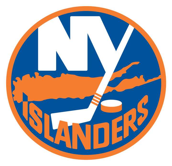
In advance of the second round, Newsday highlighted the Islander’s unique logo in a column, noting that the team is the only in the four major sports that contains a map or geographical drawing in its logo, which dates back to 1973.
In 1973, Jacob Morris Strongin, a freelance graphic designer from Syosset, created the original version of the logo, which features an orange map of Long Island, hockey stick, puck and the famous NY text. The tip of the I in “Islanders” also ends in a point aimed at Uniondale, their original home in Nassau County.
Before the 1995-1996 season, the Islanders temporarily changed the logo to the ill-fated poncho-wearing fisherman, who was phased out after just two seasons.
The original logo was brought back in 1998 with a different color scheme, before they modified it again in 2008 with a similar scheme to the original.
According to the Newsday column, when the Islanders moved west from the Nassau Coliseum to the Barclay’s Center in Brooklyn, executives wanted a new look, but former owner Charles Wang shot down the notion.
The second round of the Stanley Cup Playoff series between the Islanders and Hurricanes starts at 7 p.m. on Friday, April 26 at Barclays. The second game will be held on April 28 before the series shifts to Carolina.
Click here to follow Daily Voice Massapequa and receive free news updates.
