When new COVID-19 incident rates per 100,000 people were compared nationally, Arizona, South Carolina, and California were revealed to be the states with the highest risk for the transmission of COVID-19.
This insight was provided by a weekly, state and county-level COVID-19 data report. The data has been regularly produced for President Joe Biden and Donald Trump, which is just now being made available to the public, according to the U.S. Sun.
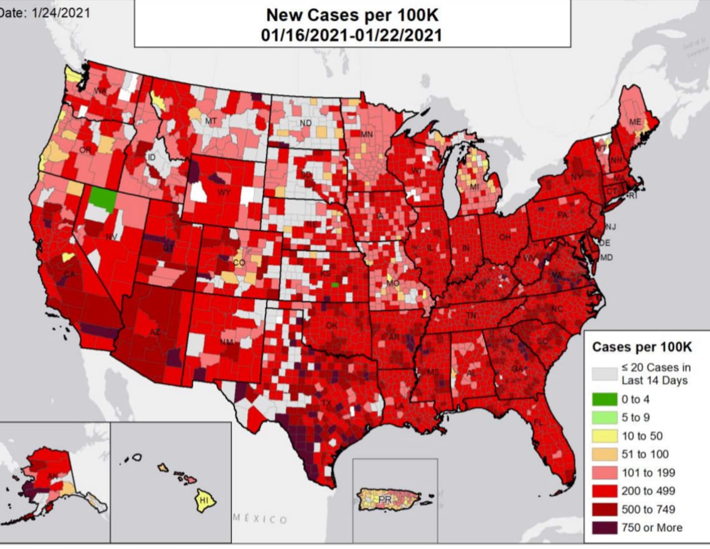
The newly revealed data reports show how COVID-19 has spread across the country over the last 6 months. Maps and graphs communicate details such as hospital bed use, PPE supplies, deaths, incidents, rates per 100,000 people, and more.
In a ranking of new cases per 100,000 people reported Jan. 16-22, Arizona, South Carolina, and California had the highest rates followed by Rhode Island, New York, Georgia, and Texas.
Massachusetts had the 14th highest rate of new cases in the nation; Connecticut had the 17th highest.
The availability of the formerly private reports was announced on Wednesday, Jan. 27, when White House COVID-19 Data Director Cyrus Shahpar tweeted a link to what he described as “previously hidden” U.S. Department of Health and Human Services state-by-state COVID-19 reports. Shahpar said new reports will be generated and shared weekly.
One of the report’s most striking features is a series of national maps that show new COVID-19 cases reported per 100,000 people. There are six maps, one for each month going back to August. The map uses a color-coded system to show where COVID-19 is most present. The darker red an area is, the more incidents were reported there. In August, the U.S. was a patchwork of gray, green, and yellow, with a concentration of red in the southeast. In December, the map was nearly all red.
To see the state reports, visit the Department of Health and Human Services at beta.healthdata.gov/browse.
Click here to follow Daily Voice North Salem and receive free news updates.