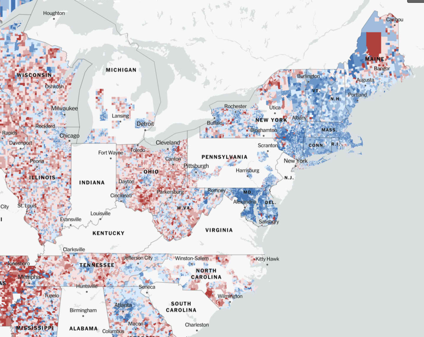
Created by The New York Times, the online map of the U.S. shows which candidate people voted for at the state, county, and precinct levels. The darker the color, the higher the percentage of voters cast ballots in favor of the Republican (red) or Democratic (blue) candidate.
Possibly the best feature of the NYT map is that it provides side-by-side voting information for the 2016 and 2020 presidential elections. It is easy to move from one map to the other and see whether a county or precinct flipped its support of Republic and Democratic candidates or put even more support behind the party it backed in 2016.
In Westfield, Massachusetts, for example, the map shows a neighborhood very much divided. Around the Westfield State University part of the city, people heavily voted Republican in 2020 - increasing their GOP presidential support by 15 points. Across the street, support for Democrats increased between 2016 and 2020 by 13 percentage points.
Click here to follow Daily Voice Nassau and receive free news updates.