Do you like Westchester County's new logo?
- Yes
- No
- Unsure
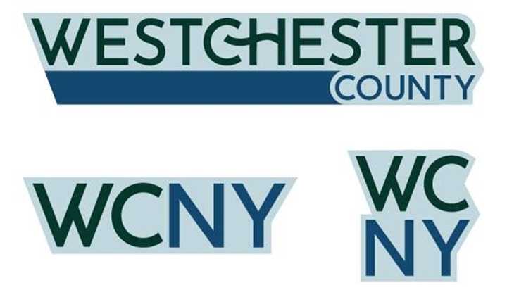
In an announcement on Thursday, Dec. 26, Westchester officials unveiled the county's new logo, which they say symbolizes connection, progress, and the natural beauty that defines the area.
The rebranding, unveiled alongside the county’s transition to a “.gov” domain, replaces the old logo, which prominently featured the county’s previous website address.
“The residents of Westchester County are linked," County Executive George Latimer said, adding, "This connection is symbolized by the hook that seamlessly joins the C and H in our logo. We’re linked by rail, road, and air. By culture. And most importantly, by choice.”
Despite this, some residents are less than impressed. In the comments section of the county's announcement on Facebook, several took to their keyboards to criticize the logo:
"If you need a new graphic designer, I know someone… this is pretty weak," wrote one commenter.
Another who said they were a graphic designer offered their two cents: "As a graphic designer and decades long Westchester resident, I have to agree it's a poor logo that's outdated before it's out of the gate. Sigh."
Another comments were just as brutal.
"The old one looks so much better. What a waste of taxpayer dollars," wrote North Salem Republicans in a comment.
"This looks like a bad arts and crafts project!" said another.
In the announcement on Thursday, County Communications Director Catherine Cioffi explained the reasoning behind the logo change: "This new logo is more than a fresh design—it’s a celebration of who we are as a community. It reflects Westchester County’s identity as a place of connection, innovation and unity.”
The county worked with Alexandria, Virginia-based ad agency Joy Riot to design the logo, officials said. It will be featured on County websites, signage, and communication materials over the next few months.
What do you think? Sound off in Daily Voice's poll above!
Click here to follow Daily Voice Bronxville and receive free news updates.
